

In my book, Perfect Time-Based Productivity, I mention the fact that Andrew Staroscik, a data visualization expert, has helped me pull together some unique views of the data I have collected so far.
As you recall, each person who has completed the training has used a form to evaluate their skills in each of the 7 Essential Fundamentals (which exclude Interrupting, Switching, Warning and Reviewing.) A typical form might look like the following picture.
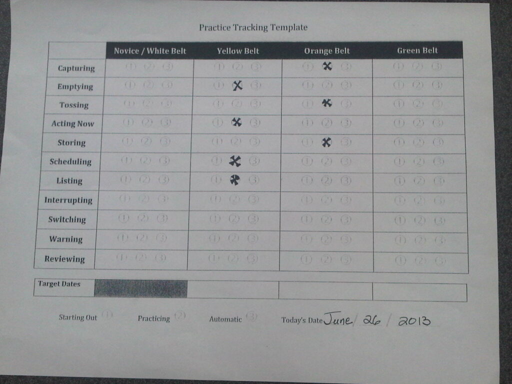
This particular example features a participant who ranks themselves as an Orange Belt in three skills and a Yellow Belt in the remaining four. Overall, their skill level would be Yellow, using the rule that one’s overall Belt takes the ranking of their least developed skill. (Further training would be required to complete the chart in full.)

In a single group, or company, where any number of employees complete these Templates after being trained, it’s not hard to pull together all the sheets into a single database and ask some interesting questions.
I have learned that the range of questions one can ask are very much based on one’s ability to “see” the data and the story it tells. This is where my skills fall short… but fortunately, it’s a place where Andrew’s talents shine brightest.
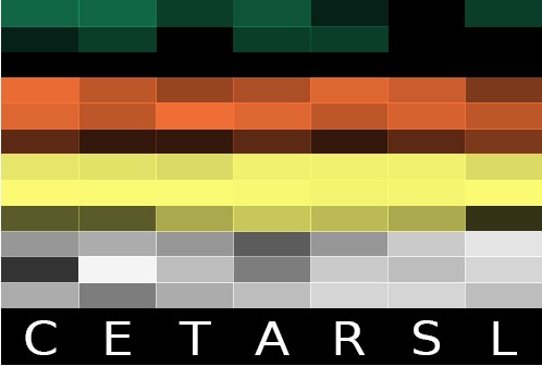
As a first step, he took the raw data from a single company and converted it into the heat map shown at left. In the diagram, C, E, T, A, R, S, L correspond to the 7 Essential Fundamentals: Capturing, Emptying, Tossing, Acting Now, Storing, Scheduling and Listing. The brightest colors show the most intense concentrations, while the darkest colors colors show the least.
Within each fundamental, there’s a range of skills from White to Yellow to Orange and Green, exactly the same as the self-evaluation form originally completed. That was enough to get me excited – but there was more to come a few weeks later.
He invented a more detailed variation of the heat map as shown above, converted to landscape mode. It reveals the relative frequencies of each of the fundamentals for this population.
For example, at top left, he shows there are four people who rated themselves a level 3 Green belt in capturing.
That top left box has the following notation at the top: F:C | B:G | R:3N 4
This means that for the fundamental Capturing, there are four people who ranked themselves at the Level 3 Green Belt.
The box below shows there is one person who ranked him/herself at Level 2 Green Belt.
I was ecstatic… until he went a step further, and with some clever programming and tremendous insight into how we view data, he produced a dynamic version of this chart shown directly below. (Unfortunately, the dynamic graphic cannot be shown.)
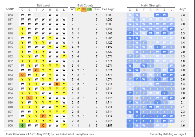
Here are some other pictures of the data. Here you can compare each student in this cohort against others. Student 010 (at the bottom of the rightmost column) appears to be the most skilled, at first glance.
The next chart shows a different cohort, ranked in skill from User # 053 having the least skill, to User #009 having the highest.
Unfortunately, the other analyses he performed have been lost. But I have retained the original wording to give you an idea of the analysis which was done. See the text below.
As a participant in the company’s program, you may be interested in knowing how you compare against others in even further detail. To answer that question, Andrew has produced a different chart (not lost, unfortunately) that brings together data from every single individual in the population who scored themselves at the same level in a given fundamental e.g. all the participants who ranked themselves a Level 2 Orange Belt in Capturing.
- First of all, this is a cell lifted from the Capturing row (the top row) and the fifth column, shaded in pink. In the blown up diagram, there’s a single box outlined in red that shows where the box is located in the larger map.
- At the very top, F:C means that this data is from the Fundamental: Capturing row. B:O means that it’s an Orange Belt and R:2N:15 shows that it’s taken from the second-level or middle column of the Orange Belts. As I mentioned, there are 23 people who checked this particular box in their self-evaluation – they make up the Pink Group.
- The people in the Pink Group happen to have skills in the other 6 Fundamentals that are distributed according to the heat map shown in the body of the cell. For example, people in the Pink Group seem likely to also rate themselves as Orange Belts in Emptying, Tossing and Storing. When it comes to Scheduling and Listing, however, they appear to be weaker – Yellow Belts mostly with few Green Belt skills.
- Also, curiously enough, members of the Pink Group didn’t rate themselves as first-level or bottom row Orange Belts in any of the other 6 Fundamentals, as shown by the empty band just below the line starting with the red box.
The next version of this particular chart will feature a rollover function in which hovering over a single box will show all the data across the entire chart for individuals who checked the box for that skill.
As you can tell, this just a start. With Andrew’s help, I have only just begun to compare one client company’s data against the overall averages. It’s revealing some interesting conclusions that the company can begin to draw about its employees’ time-based productivity skills.
At the moment, to be honest, I feel as if I am just scratching the surface. I simply haven’t had the bandwidth to fully process the data or his unique methods for displaying it.
Perhaps this is where you come in? If you have read this far on the page it means that you may have an interest in this data, and how it can be used.
Now that you have an idea of what we’re trying to do, where do you think we should take this? What would be some cool and insightful ways to use this data? Where should companies direct their attention once they have it in hand?
How can time advisers (consultants, coaches, professional organizers and trainers) use this information to target their interventions?
Or more importantly, what are we not seeing?
Let us know in the comments below or send me a private message via http://ReplytoFrancis.info.
Or, if you want to contact Andrew directly, just visit his blog at http://www.staroscik.com/
Francis
Updated Jan 27th, 2023